CSS Can Do That
CSS has always been one of my favorite programming languages. There are very few languages in web development where you get to feel so close to the browser and your user at the same time. Few programming languages let you know if it works based on the visual rendering of elements on a screen. It makes “it works!” moments so much more powerful! When CSS was younger you often needed resort to known “tricks” to get things to work right but developer ergonomics have been improving.
The improvement movement started all the way back in 2009 with the introduction of flexbox. As browsers became more evergreen and we could stop worrying about littering our stylesheets with things like @supports. The CSS Working Group was unshackled to start delivering ever improving developer experiences.
Lately when I’m asked how to implement a complicated design or component I get to answer “CSS can do that!”.
Subgrids
I wrote about my excitement for CSS Grid in 2017 and my love for this feature hasn’t waned! There is no other feature of CSS that allows you to write code in a way that resembles how the browser will render elements:
.site {
  display: grid;
  grid-template-columns: 1fr 2fr;
  grid-template-areas:
    "header header"
    "sidebar main"
    "footer footer";
}
This revolutionized how I approached writing styles for layouts and components. If you wanted or needed elements that weren’t direct children of your grid container to adhere to the grid system you defined, however, you were out of luck. You could get around this with complicated math and very strict style usage but most of the time it wasn’t worth it.
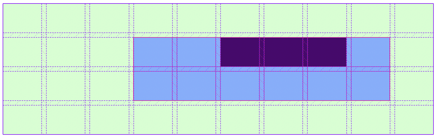
The need to solve this problem was apparent from the very moment CSS Grid was introduced but finding the right syntax and tradeoffs was difficult. After a few years of planning and tinkering I’m happy to see that subgrid support is now available in Firefox and Safari and coming soon to Chrome! This new feature allows nested elements that aren’t direct descendants of a grid container to still be able to “snap” to the grid. Here’s an example reaching an extra layer down:
<div class="grid">
  <div class="child">
    <div class="grandchild"></div>
  </div>
</div>
And our subgrid:
.grid {
  display: grid;
  grid-template-columns: repeat(10, 1fr);
  grid-template-rows: repeat(4, minmax(50px, auto));
  gap: 0.5rem;
}

.child {
  display: grid;
  grid-template-columns: subgrid;
  grid-template-rows: 1fr 1fr;
  grid-column: 4 / 10;
  grid-row: 2 / 4;
}

.grandchild {
  grid-column: 3 / 6;
}
Specifying grid-template-columns: subgrid; on the .child element allows it to inherit its parent’s grid for its own children. Powerful! Here’s a screenshot with Firefox’s amazing Grid Inspector that shows how this works:
Nesting
Two of the most importing features of the preprocessor Sass were variables and nesting. I wrote about CSS Variables but this in and of itself wasn’t enough to get most developers to ditch their preprocessor.
An important part of organizing stylesheets was being able to nest styles in logical blocks for easier writing and reading:
button {
  background: blue;

  &:hover {
    background: navy;
  }

  &:disabled {
    background: grey;
  }
}
Sass would process this and spit out valid CSS:
button {
  background: blue;
}

button:hover {
  background: navy;
}

button:disabled {
  background: grey;
}
Examples can get much more complex than this as the power of Sass’s & is incredible! 2023 brings fantastic news: nesting is coming to CSS! It’s already available in Chrome and Safari and it’s coming soon to Firefox (currently behind a beta flag). This almost removes the need to roll your own preprocessor like Sass (though there are still some benefits that you can eke out of it) which is a major win for simplifying the development process.
The best part about how the browsers are implementing this is that they’re almost exactly copying the syntax that developers have been using in Sass for more than a decade. If you’re familiar with nesting in Sass you’ll feel right at home with native nesting. For instance, the Sass example above is also valid CSS nesting! There are some caveats and I recommend reading Chrome’s introduction to the feature.
Container Queries
Media queries were transformative for web development. Instead of loading a separate site for mobile devices (mobile.example.com) you could use media queries to allow your existing markup to respond to the size of the browser window.
The “responsive development” movement lead another concept that has grown in usage: design libraries. Arguably popularized by open source projects like Bootstrap, design libraries have become a common part of modern web development and design.
The idea of a “container query” gained steam as the popularity of design libraries (both in-house and open source) grew. Why should an individual component need to know what size the browser is? For design libraries to be truly modular we need the components to adapt their container’s size, not to the browser’s.
Container queries have been a topic of discussion for web developers for about a decade now but feelings about its viability have always been pessimistic. Browser vendors have often cited complexity and performance as the major barriers to implementing this feature. All that changed in 2021 when container queries came to Chrome Canary!
The implementation is very similar to media queries but with a little extra flare for composability:
.parent {
  container-type: size;
}

.child {
  font-size: 1em;
}

@container (min-width: 800px) {
  .child {
    font-size: 1.5em;
  }
}
The @container declaration will look very familiar as it follows the same syntax as @media. The major difference here is that @container will only apply according to its nearest ancestor that has a containment context set (container-type). The requirement of a containment context is a departure from how we currently use media queries.
At first glance this may seem like unnecessary overhead but it provides web developers with extreme control over the context in which different styles are applied. For instance, you may want a component to behave differently if it’s in a sidebar or embedded in the middle of an article. With container contexts and the ability to name them you can do just that:
.sidebar {
  container-type: size;
  container-name: sidebar;
}

.post {
  container: post / size; /* shorthand for name / type */
}

.component {
  font-size: 1em;
}

@container sidebar (min-width: 400px) {
  .component {
    font-size: 1.25em;
  }
}

@container post (min-width: 400px) {
  .component {
    font-size: 2em;
  }
}
This will be a powerful tool and I can’t wait to see what web developers do with it!
Looking Ahead
These three items happen to be near and dear to my heart but there are so many more new features coming to CSS. It’s been an explosive last few years for the language. For once it’s actually been hard to keep up with everything!
The Chrome Developers team put out a blog post talking about what to look forward to in 2023:
There is a very bright future for CSS. Happy styling!